A Decade of Pantone: 2010-2019
Blogs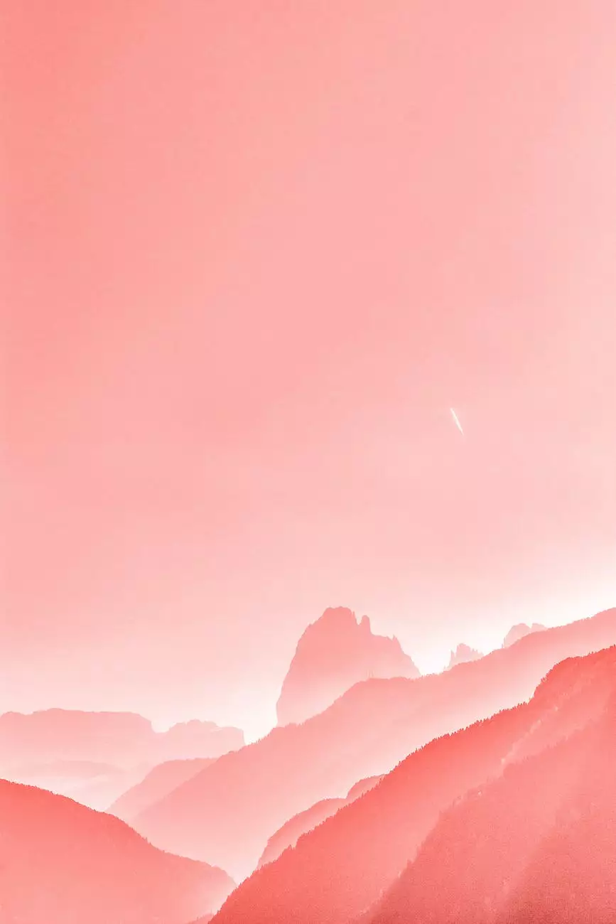
Welcome to "A Decade of Pantone: 2010-2019," where we explore the fascinating journey of Pantone colors throughout the past ten years. As a leading provider of SEO services in the business and consumer services industry, we understand the importance of staying up-to-date with design and color trends. Join us as we unravel the significance of each year's Pantone color and its impact on design and creativity!
2010 - Turquoise Takes Center Stage
In 2010, the Pantone Color Institute declared "Turquoise" as the Color of the Year. This vibrant shade symbolized tranquility, escape from the everyday troubles, and a sense of hope for the future. Turquoise quickly became a widely embraced color, dominating the design landscape in various industries. From fashion to interior design, this captivating hue infused a touch of serenity and sophistication into the world around us.
2011 - Honeysuckle Heralds Optimism
The year 2011 welcomed "Honeysuckle" as Pantone's Color of the Year. This vivacious and uplifting pink hue symbolized courage, confidence, and the release of inhibitions. Honeysuckle burst onto the scene, invigorating everything from fashion runways to graphic designs. Its energetic nature acted as a catalyst for creativity, encouraging individuals to express themselves boldly and embrace optimism in all aspects of life.
2012 - Tangerine Tango Sets the Stage
Tangerine Tango, the fiery reddish-orange hue, took center stage as the 2012 Color of the Year. This dynamic color exuded energy, motivation, and an irresistible sense of adventure. With its warm and inviting nature, Tangerine Tango brought a burst of vitality to any design it touched. From fashion and home decor to graphic design and product packaging, this vibrant shade left an indelible mark on the creative landscape.
2013 - Emerald Imparts Sophistication
The year 2013 embraced the timeless elegance of "Emerald" as Pantone's Color of the Year. Symbolizing balance, harmony, and rejuvenation, this rich green shade became highly sought-after in the design world. Emerald's lush allure made it a versatile choice for a wide range of applications, from fashion and accessories to interior design and branding. It added a touch of luxury and sophistication to any project, capturing attention and leaving a lasting impression.
2014 - Radiant Orchid Blossoms
Pantone's 2014 Color of the Year, "Radiant Orchid," enchanted the world with its enigmatic charm. This captivating blend of purple and pink hues represented creativity, originality, and an invitation to embrace one's individuality. Radiant Orchid graced fashion runways, interior spaces, and branding materials, imbuing them with a sense of enchantment and mystery. Its versatile nature offered endless possibilities for designers to express their unique vision.
2015 - Marsala Adds Warmth
In 2015, "Marsala" took the spotlight as Pantone's Color of the Year. This earthy, wine-inspired shade evoked a sense of warmth, sophistication, and grounded stability. Marsala brought a touch of nature and organic beauty into various design fields, including fashion, art, and interior design. Its deep, robust tone created a sense of timelessness and elegance, complementing a wide range of styles and aesthetics.
2016 - Serenity and Rose Quartz in Harmony
2016 introduced a unique concept of having two Colors of the Year: "Serenity" and "Rose Quartz." Serenity, a soft tranquil blue, and Rose Quartz, a delicate blush pink, came together to represent balance, tranquility, and gender fluidity. These soothing shades permeated the design industry, from fashion and beauty to graphic design and home decor. Serenity and Rose Quartz allowed designers to explore new possibilities and create harmonious compositions.
2017 - Greenery Refreshes the Palette
Pantone's 2017 Color of the Year, "Greenery," breathed fresh life into the design world. This vibrant and zesty yellow-green shade symbolized rejuvenation, vitality, and a connection to nature. Greenery found its way into fashion, interior design, and graphic design, injecting spaces and designs with an invigorating burst of energy. Its versatility allowed it to be used as a feature color or a refreshing accent, instantly transforming any project into a lively and welcoming experience.
2018 - Ultra Violet Ignites Imagination
The year 2018 embraced "Ultra Violet" as Pantone's Color of the Year. This mystical and enigmatic shade ignited imagination, creativity, and exploration. Ultra Violet captured attention and pushed boundaries in various fields, from fashion and beauty to art and interior design. Its deep, cosmic hue inspired individuals to think beyond the ordinary, sparking innovative ideas and self-expression.
2019 - Living Coral Radiates Warmth
Bringing the decade to a close, Pantone's 2019 Color of the Year was "Living Coral." This vibrant yet mellow hue embodied warmth, joy, and optimism. Living Coral infused spaces, designs, and products with a delightful burst of energy and playfulness. The color's versatility allowed it to transition effortlessly from fashion runways to product packaging, captivating audiences with its inviting and spirited nature.
Throughout the past ten years, Pantone's Color of the Year has guided and influenced designers, creatives, and trendsetters across numerous industries. These remarkable hues have shaped the way we perceive and interact with the world around us, sparking emotions, expressing personalities, and impacting design trends. As SEO experts in the business and consumer services sector, we recognize the importance of staying informed about these trends, enabling us to offer comprehensive and cutting-edge services to our clients.
Join us at "A Decade of Pantone: 2010-2019" as we celebrate the impact and beauty of Pantone colors throughout the years. Discover the profound influence of each year's color and unlock a world of creativity and design possibilities. Let us embark on this mesmerizing journey together and embrace the power of color!

